I'm obsessed with home interiors. There. I said it. So when my cousin Erica, who is expecting her first child (a girl), asked for a little input with her nursery I squealed in delight (ok, maybe not. but i was squealing on the inside).
I should've taken pics of the already-adorable room. Butttttt I didn't. It is painted in a warm gray tone, there is terrific natural light, neutral carpet (hardwoods underneath), nice big closet, and a pretty view of the backyard! What's not to love?
She was thinking of keeping the walls their current color - which I whole heartedly support. Painting = thumbs down. Walls that are pretty and already painted = thumbs up. She also has some vintage green suitcases that she wanted to incorporate....hmm.
So here is a little rendering I did to get her wheels-a-spinning. Now, when I do room "plans" - I use that word loosely. They aren't really meant to represent every little thing to the very last detail...it is just to create a feeling and to sorta visualize how certain things look together. Faux bear rug not your thing? That's completely fine, a nice tone on tone ivory stripe would also work just lovely. Hate that yellow lamp? Substitute it with a cute garage sale find. No worries.
So there you have it. My Mini-virtual baby nursey makeover! I'd love to stay and chat some more, but I've got a serious date with my dvr.
Have a great night!
Casey
Showing posts with label decorating. Show all posts
8.08.2011
Baby Makeover.
Labels:
baby,
decorating,
new beginnings,
upgrades
7.19.2011
Baby Mania Posters!
Baby Mania POSTERS! Nursery Wall Art!
ATTENTION: ALL NEW MOMS, OLD MOMS, MOMS, DADS, SISTERS, FRIENDS...EVERYONE.
As some of you know, I make these baby posters as a little hobby. I've gotten SOOO many requests to make these for my friends at work, friends of friends, etc. After some pressure from a few people, I thought I would offer these little gems to the masses....So here is the rundown:Cost: $30...if I have to ship it, that will be a little extra.
Size: They fit perfectly in an 11x14 frame.
These are COMPLETELY custom - any variety of colors & phrases. The perfect wall art for any nursery, bedroom, playroom - anywhere!
If you are interested email me at caseyjodi@gmail.com (PUT BABY POSTER IN THE SUBJECT LINE) - send me your list of facts/phrases and color scheme. If you'd like, for colors you can send me links to your fav bedding at target, a pic of your nursery, etc.
Popular Fact Ideas:
First Name
Middle Name
Last Name
Birthday
Time of Birth
Weight
Length
Eye Color
Hair Color
Popular Phrase Ideas:
The Sun Was Shining
Daddy's Grin
Gift from God
Little Princess
John & Sue Proud Parents
![]() | ||
**I do not own these nursery pics. Couldn't find the source.
Labels:
baby,
decorating,
posters
3.15.2011
Bathroom Update, part II
Here she is! The afters. So here is what we did.
We painted. Out with the goldenrod an in with soft gray. The color is Ash from Restoration Hardware in semi-gloss. The color is a lot more neutral and more fitting with the current fixed elements as I discussed here. Because the color is so light I decided to paint both the walls and ceiling. Our ceiling was previously painted with cheap paint not meant for high-moisture areas = peeling, chipping paint...not pretty. I also painted inside the molding on the back of the white door for a little tone-on-tone action. No one will probably notice but me, but iLove. In summary, I love the color and vie learned bright, bold color doesn't necessarily mean BIGGER impact. I don't think a room should scream at you when you enter...and definitely not a bathroom.
We added storage. We removed our chrome bathroom rack and added a pair of floating shelves. The rack was beginning to rust due to the high moisture and I couldn't find another bathroom shelf that would suit my needs. The shelves I chose are the same wood tone as the vanity cabinet so they blend seamlessly into the space. I use the shelves to store a few extra towels and wash clothes, our Sony Air unit, and a basket for closed storage - toothbrushes, toothpaste, tweezers, etc. I purchased a coordinating basket for the top of the toilet for extra TP. Even though I "lost" a lot of storage by removing the medicine cabinet and metal rack, I actually feel I gained much more usable storage. All within an arm's reach.
We got a bigger mirror. If you read my previous bathroom post, you are already familiar with my strong distaste for our previous medicine cabinet. We got rid of it! We opted for a larger mirror to fill the space that was wasted. We chose a rectangle mirror with a travertine surround. The color of the stone ties in beautifully with the counter top & floors. We found this beauty at Lowe's on a total whim. I spent weeks searching for the perfect mirror to fit in the somewhat odd shaped void...I was hoping I wouldn't need a custom mirror made, luckily this one worked out - straight from the box!
The whole process took several weeks of planning, purchasing, and researching what I wanted to do. We were able to complete the labor in a weekend, and I created the artwork a few days later. We are very happy with the update and love that our tiny bathroom is now much BIGGER in style.
Casey
We painted. Out with the goldenrod an in with soft gray. The color is Ash from Restoration Hardware in semi-gloss. The color is a lot more neutral and more fitting with the current fixed elements as I discussed here. Because the color is so light I decided to paint both the walls and ceiling. Our ceiling was previously painted with cheap paint not meant for high-moisture areas = peeling, chipping paint...not pretty. I also painted inside the molding on the back of the white door for a little tone-on-tone action. No one will probably notice but me, but iLove. In summary, I love the color and vie learned bright, bold color doesn't necessarily mean BIGGER impact. I don't think a room should scream at you when you enter...and definitely not a bathroom.
We added storage. We removed our chrome bathroom rack and added a pair of floating shelves. The rack was beginning to rust due to the high moisture and I couldn't find another bathroom shelf that would suit my needs. The shelves I chose are the same wood tone as the vanity cabinet so they blend seamlessly into the space. I use the shelves to store a few extra towels and wash clothes, our Sony Air unit, and a basket for closed storage - toothbrushes, toothpaste, tweezers, etc. I purchased a coordinating basket for the top of the toilet for extra TP. Even though I "lost" a lot of storage by removing the medicine cabinet and metal rack, I actually feel I gained much more usable storage. All within an arm's reach.
We got a bigger mirror. If you read my previous bathroom post, you are already familiar with my strong distaste for our previous medicine cabinet. We got rid of it! We opted for a larger mirror to fill the space that was wasted. We chose a rectangle mirror with a travertine surround. The color of the stone ties in beautifully with the counter top & floors. We found this beauty at Lowe's on a total whim. I spent weeks searching for the perfect mirror to fit in the somewhat odd shaped void...I was hoping I wouldn't need a custom mirror made, luckily this one worked out - straight from the box!
The whole process took several weeks of planning, purchasing, and researching what I wanted to do. We were able to complete the labor in a weekend, and I created the artwork a few days later. We are very happy with the update and love that our tiny bathroom is now much BIGGER in style.
Casey
Labels:
bathroom,
decorating,
upgrades
3.03.2011
I know what I am...
Here's a quick little visual quiz to help steer your decorating sense in the right direction! There's no wrong answers! WOOHOO! I LOVE being right!
60% Rustic Revival
40% Cottage Chic
Rustic Revival
You can take kid out of the country but you can't take the country out of the kid... or is your theme "you can take the kid out of the city, but you can't take the city out of the kid?" Either way you play it, you are one of the unique individuals who loves a mix of modern and country. The clean lines of the modern softened by rustic /vintage elements is the perfect mix in your mind. And can we blame you? You've taken the best aspects of two popular designs and mixed them in a manner that appeals young and old alike. A subtle background of white or light colors provides a nice canvas for all the wonderful flea market, eBay or garage sale finds as well as the classic modern pieces that you love.
...but what are you?
casey
photos & link from - http://www.sproost.com/
60% Rustic Revival
40% Cottage Chic
Rustic Revival
You can take kid out of the country but you can't take the country out of the kid... or is your theme "you can take the kid out of the city, but you can't take the city out of the kid?" Either way you play it, you are one of the unique individuals who loves a mix of modern and country. The clean lines of the modern softened by rustic /vintage elements is the perfect mix in your mind. And can we blame you? You've taken the best aspects of two popular designs and mixed them in a manner that appeals young and old alike. A subtle background of white or light colors provides a nice canvas for all the wonderful flea market, eBay or garage sale finds as well as the classic modern pieces that you love.
![]() |
| from sproost.com |
Materials
The material palette for urban country runs the gamut because of the two extremes being mixed. On the countryside you see a lot of wood, woven rope, canvas and linen, rustic metals and wrought iron, cowhide and vintage leather. On the more modern side, you see acrylic, satin and polished nickel and chrome, glass, faux fur, refined leather, fiberglass and sleek woods. It's the mixing of these elements that makes the style work so well. Seagrass and other natural woven materials are often used for floor coverings. Concrete and natural wood floors are very popular, and work really well together.Colors
When it comes to color, think light, casual and airy. White, pale gray or beige, khaki and sage; all of these colors make nice, subtle backdrops for Urban Country style. Think of the colors of natural linen, concrete, and if you'd like to go dark, use the dark brownish-black of iron or the deep burnt orange of rust. The key is to keep the spaces feeling open (go modern!) and yet warm (yay for rustic!), and by going light on the walls and major pieces and more color on the accents and accessories you can achieve this mix really well.Cottage Chic
Who says that cottages can't be modern and chic? Who says that they have to be floral and cheesy? Not you! You love the carefree spirit that the cottage interior inspires, but you are also serious about your appreciation for modern art and hip treasures. You love old and new alike, and love to highlight them all to expose the uniqueness of each. What better way to show off these treasures than with a light background?![]() |
| from sproost.com |
Materials
You have a great sense of humor when it comes to design and even like to make fun of the style itself. Which means that you will throw in a toy boat or a vintage life preserver to keep the mood of the place just like the color: light! The fabrics are natural (cottons and linens) and are light in touch. Much of the furniture is wood or wood framed (the lighter the better, think driftwood!) and as long as it's used sparingly or with modern lines, you even throw in a wicker piece here and there.Colors
Your true inspiration (whether you know it or not) is the sea... the colors found at your favorite beach: white and light beige of the sand, a variety of blues for the ocean and sky, and greens and pale grays of the sea glass... but the key is white! Your space should feel light and airy and give off the mood one has when at the beach: laid back! The key with Cottage Chic is balance; in one corner there could be a rustic wood table that looks like it could have been found rather than made, but it is offset with a modern vase while another corner is adorned with a modern Lucite piece.Space Planning
The furniture is comfortable and the layout is cozy. The more it encourages intimate gatherings the better! Just watch out for the red wine spills on the new white sofa! The color throughout is light and airy - and though you love to accessorize with fun colors (the sky's the limit with a white background), the main color seen and felt throughout the house is white or very light versions of colors so that they feel almost white....but what are you?
casey
photos & link from - http://www.sproost.com/
Labels:
decorating
3.01.2011
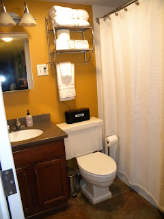
Bathroom Update
| "Fun Sized" Bathroom |
1. Size. Yes, size does matter. Especially in a bathroom...our only bathroom. Vince and I have the same work schedule, so we must plan our mornings so that both of us have ample showering, teeth brushing, & grooming time. It is not uncommon for us to double up in the bathroom in order to make this arrangement work - Vince showers while I brush my teeth; I shower while Vince stares into the mirror at his cute face...etc.
2. Storage. In my opinion, storage is the most important "element" in the bathroom...of course after all of the basics are covered - toilet, shower, sink, lighting, mirror - CHECK! We've got those! Storage, not so much. There unfortunately isn't a linen closet in our bathroom...so no place for extra towels, tp, toiletries, etc. There is not enough floor space for a free-standing piece of furniture to house anything we wish to hide. And we are also lacking counter space as well...so not a lot of wiggle room to place toothbrushes, hand soap, & decorative items without overcrowding.
| U-G-L-Y medicine cabinet. |
The Positives.
The fixed elements in our bathroom are actually pretty nice...we don't have a seafoam tile shower or a pink sink or a flat mirror with the bulbs across the top...Because if we did, this would be a much larger project. I'm pretty set on my white towels & shower curtain...no need to purchase new items for a new scheme. The space is small, but it is efficient...everything works...everything is clean...and the fixed elements aren't offensive to look at.
Stay-tuned for the updated photos...I'm thrilled with the results!
Casey
Labels:
bathroom,
decorating,
upgrades
Subscribe to:
Posts (Atom)


